Content Marketing Mix: Content, Layouting and Design
You’ve heard the perhaps most cliche 3-word phrase of the digital marketing age before: Content is king. There’s another truth to it: Content is easy. There’s content everywhere. In content marketing, the “meat” of your content is vital – just as vital is how you present it to your audience.
This entry is part of our Content Marketing Series: Breaking Down Content Marketing.
Information Overload
According to Google, there are more than 130 million books in our world today. The average human being can read around 2,000 books in his/her lifetime. We are living in the information age. We are living in the age where people will always have an alternative.
Where there is always a purple cow.
You’ve got the best and latest of the web at your fingertips thanks to Google Hummingbird. Search results are retrieved at a rate faster than ever before, and search queries are understood contextually and situationally better. People have a choice in choosing where they get the information they’re looking for.
The question is: How can you be the best webpage to show them that information?
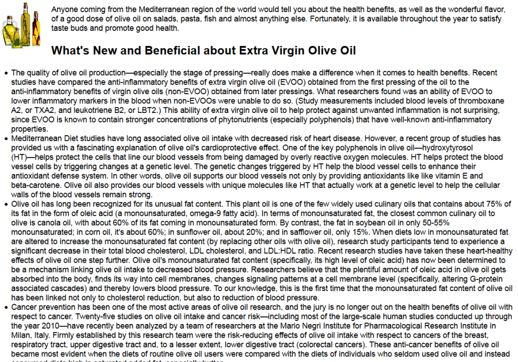
Here’s an example of informational content that’s written out:
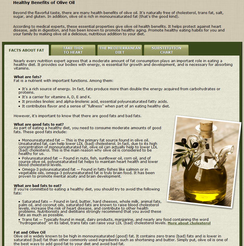
The thing is, there’s other pieces of content out there that are like it. Only presented better. Take this for example:
The little differences in layouting such as spacing, font styles and bullet points make a huge difference in how easy it is for your users to digest your content.
You can write content at amazing depths. But you can’t win with just content. You have to make other on-screen factors such as layouting and design work for you. Content is easy.
Meticulous Work
Layouting gives a whole new dimension to your content. Yes, it makes it a little more difficult to get your content out if you put a lot of attention to layouting but it’s a huge win because it makes your content pleasant to read. It has to do with visual. Styling your words, your font styles and sizes for your readers. Managing spacing and indentations. Knowing when to use blockquote, align center, or even strikethrough.
Layouting is a kind of a big-picture perspective of your webpage’s outlook.
It may seem simple but it makes a world of a difference between content that’s shunned and content that’s read, loved and shared.
The 65% Proof
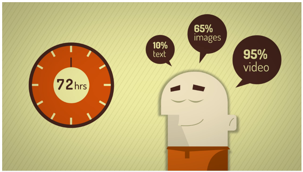
Layouting takes your content further to pleasant readership. Design takes your content further to increase memory retention rate. After three days, the average person is able to remember 10% of a piece of text information. If it’s an image, 35%. If it’s content with pictures and good design, memory retention shoots up to 65%!
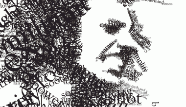
Yes you want to churn out good content. Yes you want it to be pleasant so it will be read. Now you want people to remember – and the best way is to mind your design and pepper it with pleasing, relevant pictures. We are at the day and age of awesome images. Pictures and graphics are everywhere. Most of them are amazingly done.
But I’m not talking about just pictures.
Design deals with how other elements of your website affects your content’s outlook. Sidebars, header, footer, you name it. These all factor in with a person’s memory retention rate of what you have to say. Content marketing starts with creating an impact on your audience that will last.
Tips for Keeps: Look around the web and do searches for the best web designs, layouts, landing pages, etc. You’ll find a ton of wealth on how you could fashion your content for the best impact – so much so that it will be remembered.


