How We Increased Our Return Visits Through Push Notifications
We love return visits. That means that people actually care about what we have to say. That means people are getting familiar about who we are. That means that you’re doing your job as a digital marketer. That means more user activity which leads to better rankings. That means more leads. Better leads. And we all know where the rainbow leads, right?
To the pot of gold.
Emails are Cluttered
We all know it. Just take a look at your inbox. How many emails are unread? How many emails are in your Social tab? Promotions tab? Spam? There’s just too many emails coming in.
Some of it is our fault. After all, we allow ourselves to subscribe to so many things without thinking of the consequences of clutter.
Some of it though, is not our fault. There are people out there who prey on the weak. Who exploit loopholes in the email universe. Who care nothing our email inbox’s well-being. They’re called spammers.
I know, I know. You’re not a spammer. But the fact of the matter is, you’re trying to buy some attention alongside them. Alongside all the social emails, promotion emails, spam emails, important emails, request for interview emails, and so on.
You get drowned out in all the noise. Your subject line is skimmed and your email goes down the abyss.
There’s just no way you can always retain a reader effectively via email anymore.
Unless there is another way.
A Little Push
When I was asked to check out Pushcrew, I was in an extremely busy time of my life. Ironically, I left the email as unread and continued on with my day.
It wasn’t until days after that I finally went back to the email and gave Pushcrew a try.

Signing up was easy and straightforward. There’s not much fluff on the onboarding process. I signed up just last January 26, 2016 and I already got 1,520 opt-ins.
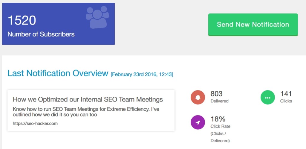
My last sent push was about our last article “How we Optimized our Internal SEO Team Meetings for Extreme Efficiency” at that time I only had about 1,100+ in my optin list. I sent out a push and it was delivered to 803 people, 141 of whom clicked on through to my article.
18% is a good number when talking about click-throughs. My email newsletter gets approximately 5% click-throughs and that’s on a good day.
Creating a Push
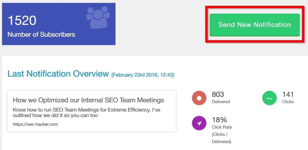
Notice that big green button that says “Send New Notification” ? That’s Step 1.
It will then take you to a page where you can set your next Push notification. Take note of the limit in characters that you can put in.
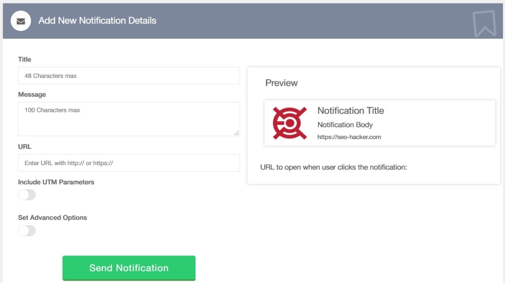
A push has four main attributes where you can put content in:
- TItle
- Image
- Message
- URL
Title is very important. It’s arguably the first thing that your subscribers will see. If it does what it is supposed to do, it gets you the click. Otherwise, it leads them to read the message. Any less than that, they would most probably unsubscribe – which is a sad, sad thing.
The Image is the next most important thing because it’s the only thing that fights for the attention of your subscriber aside from the title. My advice is for you to use a customized image each time you send a push. That increases your chances of being clicked.
Your Message is obviously important because it strengthens your title’s claim. There’s only 100 characters. Use it wisely.
URL is the last because all your users will see is the TLD. They won’t see the URL slug. So as a click-through factor, this doesn’t matter much.
If you’re good to go, send out your notification and your subscribers should be able to see it immediately.
Mobile Effect
What I love about Pushcrew is its ability to capture attention from mobile opt-ins. While Pushcrew works only with a handful of browsers as of now, those browsers also exist in mobile. So whenever you send out a push, a notification gets to sit in a mobile user’s notifications area.
And it sits there until it is actually clicked – or touched for that matter.
Here’s how a Pushcrew notification looks like on mobile:
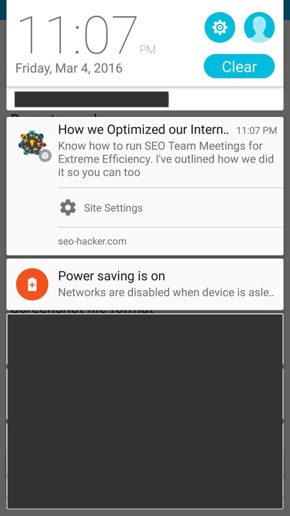
Beautiful isn’t it?
Notice that I sent it on 11:07 PM? That’s HKT. When you convert that to GMT that’s 3:07pm. I sent the notification on 3:06pm GMT

Just one minute after sending a push notification, 46 people already clicked to check out my article.
How does an Opt-in Look Like?
It depends. If you’re on the free plan, here’s how the opt-in would look like:
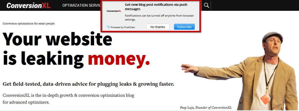
Nice right? However, when you click on ‘Subscribe’ it takes you to a redundant step and a pop-up window (which is irritating).
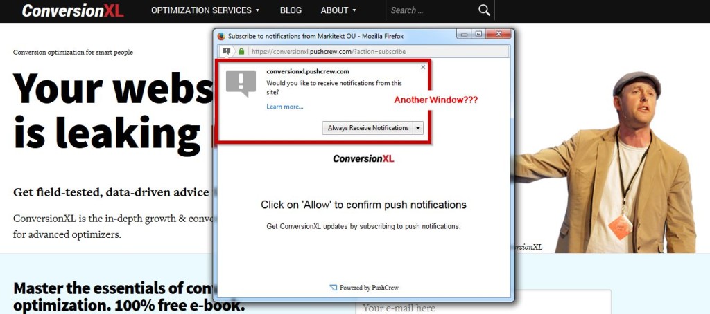
You have to click on ‘Always Receive Notifications’ and ‘Allow’ the website to send you push notifications. That right there? That decreases your chances of getting an opt-in by an approximate 80%. But here’s what’s worse:
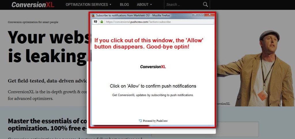
If you accidentally click out of the window, the ‘Always Receive Notifications’ button will disappear. For good. You’ll need to reload the page and go through the 3-step process again.
Thankfully, there’s the better way of asking your users to opt-in. The Native way.
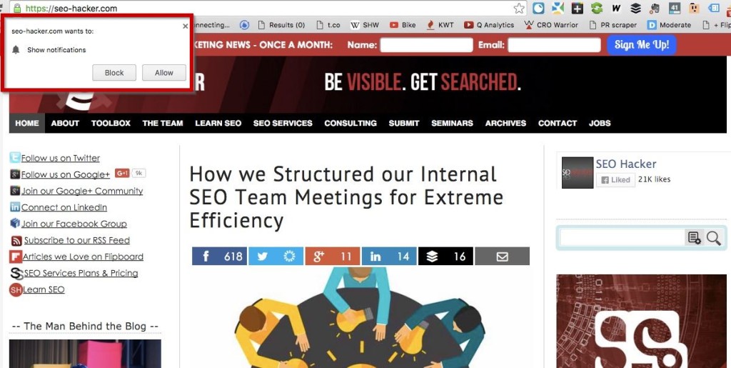
Seamless. Beautiful.
However, this requires some more steps on installation rather than just copy-pasting a tracking code. You have to put in exactly 4 files in your website’s root folder and paste an additional tracking code.
Is the trade-off worth it? You bet!
I can almost guarantee that my conversion rate in terms of opt-ins for my push notifications is at least 100% better than websites who are not using the native optin feature.
Give Pushcrew a try. It’s the best complement to your email newsletter for return visitors.