5 Simple Landing Page Optimization Tips
Eight seconds. That is all the time you have to capture a person’s attention, according to The Associated Press. Busy schedules and non-stop media barrage are quickly taking up your potential customers’ attention. You have just eight seconds to make a solid impression and get them to your next step. In the digital world, this super, most important first impression is called your landing page.
Webmaster’s Note: This is a guest post by Alicia Lawrence
What is a landing page and why do I need one
A landing page is a tailored webpage that appears after a user has clicked on an advertisement or inbound link. It is more specific than your homepage and contains a strong call to action. Landing pages have a proven track record of increasing conversions. But you are going to need more than one to do the trick. In fact, you should have a landing page for every campaign you run. When companies increased their number of landing pages from 10 to 15 they saw a 55% increase in leads, according to HubSpot’s Marketing Benchmarks report.
Landing pages should include:
- Logo
- Brief but direct description and call to action
- Clear and enticing headline
- Supporting image
- Reviews or social endorsements
- Clean, brand-consistent format with contrasting colors
- Sign up button or contact form
- Centralizes on User Experience
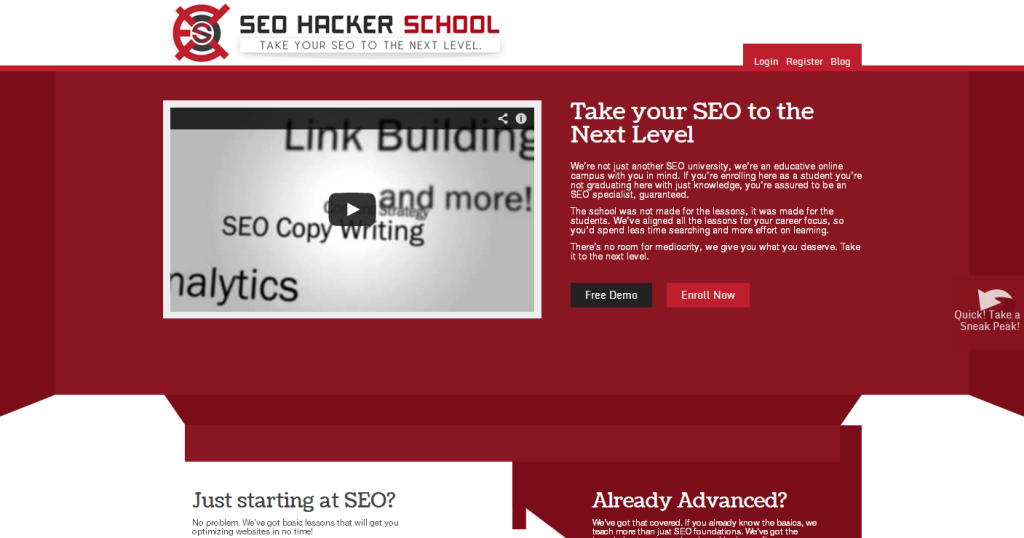
Take for example the landing page for SEO Hacker School. Sean did a great job making sure his landing page format is consistent with his branding using the contrasting red and white colors to grab the user’s attention. Instead of an image he has a video, which is great as long as it’s not set to automatically start causing the user to be annoyed and click off.
Notice the headline is as large as his logo drawing his readers to the brief description below that urges them to enroll in SEO Hacker School (the obvious call to action). Besides the button to Enroll Now is the Free Demo, an excellent choice to include when the real call to action requires money.
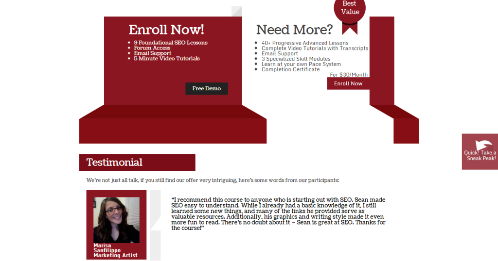
All the information a reader would need to click for a conversion can be found above the fold. Sean uses a long landing page, which is currently the trend, and repeats his call to action further down the page. The call to action should always be seen wherever the user is on the landing page. Towards the bottom of the landing page are a few great reviews of his program, further convincing his potential customers to sign up.
There are other links on the landing page, such as the sneak peak to the lessons, login, register and the SEO Hacker blog. While the login and register tabs won’t distract the potential customer, the sneak peak and blog should open up in a new window if clicked. Especially for the blog, since its content is time consuming and distracts from the main call to action.
How to optimize your landing page
After you’ve created a landing page or decided to go with an applicable existing page. Use A/B testing to make it as effective as possible in turning over conversions. Don’t make the two pages drastically different when testing, instead use small changes so you can see what works and what doesn’t.
Continue to monitor your landing page and make changes as necessary even after it has gone live. Set up Google Analytics conversion goals to monitor your landing page’s success. A big signifier if your landing page is performing correctly will be the bounce rate. Bounce rates vary from site to site; perhaps you are attracting the wrong traffic, but a high bounce rate also could mean your reader found exactly what he or she was looking for and hence does not need to stay on your page.
Since landing pages have a direct call to action to click or sign-up, a high bounce rate means the user wasn’t interested in your offer and left. A normal webpage bounce rate is around 40%. If your landing page does not have any navigation, besides that one call to action, the average bounce rate is around 80%.
Tips for lowering your bounce rate:
-Keywords: Have relevant anchor text so the user knows what to expect when they click the link.
-Navigation: Consider leaving out your navigation bar, which will distract your visitor from the call to action. You can put the navigation on the “thank you” page after the reader has completed the action.
-Decluttering: Remember you only have eight seconds to get your potential customers’ attention, so design your landing page with a simple and attractive format with text that is easy to read.
-Load speed: Not only is this a ranking factor and part of your Adwords quality score, but also a one-second delay in load time results in a possible 7% loss in conversions. Your landing page should load in under three seconds.
-Open external links in a new window: If you do decide to have other links on your site besides your call to action, open them in a new window by setting the link target to “_blank”.
Landing pages have too much potential to ignore them any longer. One of the biggest reason people don’t use landing pages is because they are too busy to create and test them. Having a freelancer or outside company design a simple template to use for all your landing pages would definitely be worth your investment in the long run.


