Here’s a Quick Way to Identify If You’re Ready for Google’s Mobile Search Update

Mobile-geddon. Mobile-pocalypse. However you’d like to call it.
Everybody’s talking about Google’s recent announcement on mobile search update that will surely affect search engine rankings of many websites – especially for those who aren’t so prepared.
Starting April 21, we will be expanding our use of mobile-friendliness as a ranking signal. This change will affect mobile searches in all languages worldwide and will have a significant impact in our search results.
Note: To know more about this update, you may visit Search Engine Land.
This is not just another update. The aim is to provide mobile users a better search experience.
Many believe that this has been in the works for a long time now. In fact, over the last couple of years, Google never fails on encouraging webmasters to give attention on improving user-experience, pushing them to make websites mobile-friendly.
While many have secured their websites’ responsiveness even before the said update was announced, there are still those who didn’t take heed of Google’s reminders making the necessary changes, and those who ensured their websites are mobile-friendly yet aren’t certain if they’re ready for the biggest mobile search update this year.
I know you’re too busy to worry about this thing, and you probably don’t have much time to get so technical about this, but what’s good about this generation is that we’re surrounded by so many applications, softwares, and tools that can actually lighten our burdens, and allow us to do other important things.
So, to help you lessen the load, I listed down four of the most amazing and easy-to-use mobile-friendly test tools.
1. Google’s Mobile-Friendly Test
This tool is very easy to use, as you only need to enter your website’s URL for it to generate a report that will tell whether your website is mobile-friendly or not. It sees your website the same way Googlebot does rather than mobile users might see it. Aside from that, it also allows users to see the actual view of websites on mobile.
It’s easy to know whether you pass the test or not.
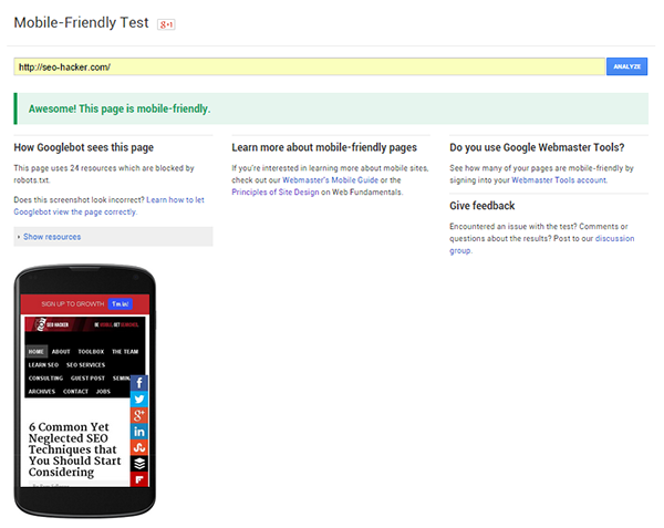
This is the example report of a mobile-friendly website:
And this is the example report of a website that isn’t mobile-friendly:
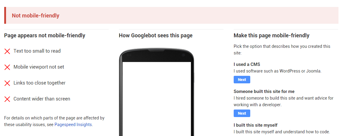
But don’t worry, as this tool provides all the reasons why your website failed, and the necessary actions you can take to make it responsive.
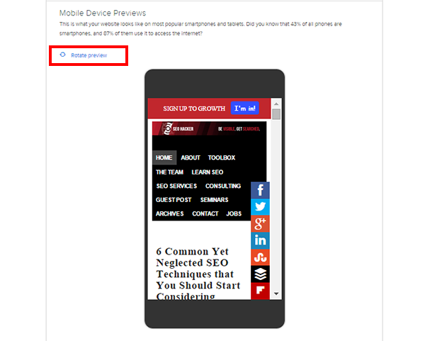
Just like Google’s Mobile-Friendly Test, HubSpot’s Marketing Grader has the capability to analyze if your site is responsive enough. It gives users the freedom to see the actual view of their websites on mobile, plus the ability to preview a rotated version.
Aside from the mobile aspect, Marketing Grader also provides free audit for blogging, social media, SEO and lead generation.
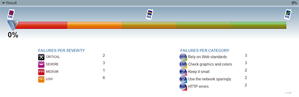
The World Wide-Web Consortium (W3C) provides a more detailed and technical analysis as well as recommendations that site owners can follow to meet the standards of a good, mobile-friendly website. It also provides a severity rating for each of their findings.
If you’re knowledgeable with all the technical components of your website, this is the best tool to determine your website’s mobile-friendliness.
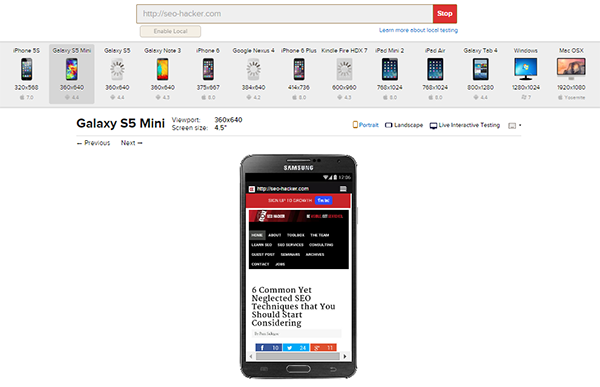
4. BrowserStack
BrowserStack is the tool I’m using to support all the analysis and recommendations I’m getting from other mobile-friendly checker tools. The best bit about this tool is that it gives you actual screenshots of how your website looks on each device.
Also, you have the option to view your website on different operating system, may it be mobile phone, tablet or desktop.
Conclusion
Don’t let your site be left behind with all the algorithm updates! Remember that the best way to stay in the battle for ranking well is by being updated, and by actually executing the necessary modifications to your website.
Over to you!
Do you have other mobile-friendly test tools to share with us? Share them by commenting below!