8 Web Design Flaws that Can Ruin your Site’s SEO
When it comes to creating a website, one of the first questions you should ask yourself is, “Should I focus on a fantastic design and user experience or on search engine optimization?”
Webmster’s Note: This is a Guest Post by Andrew Smith
This opposition might seem senseless at first, but take note that there have been lots of cases when some mind-blowing animated design has negatively affected a website’s SEO. While it is reasonable to expect that a beautifully-designed website will result in an increase and retention in visitors, you must be objective enough to realize that a good-looking website is simply not the end of it.
Most web designers intentionally ignore SEO as it “limits their artistic possibilities”. But the point is that there is no need to cut down all the design features for the sake of optimization. Designers should work together with SEO specialists and developers to find a formula that would meet both the preferences of users and the requirements of search engines.
Moreover, the bridge between Design and SEO has a common trap that we need to avoid: SEO-friendly sites that are going through a big redesign requires careful monitoring, as the impending design can hurt the site’s SEO.
What are such design errors? Here are eight of the most common mistakes web designers make:
MISTAKE #1 – Splash Pages
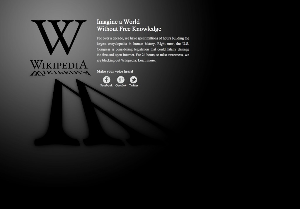
Eye-catching splash screens can be a cool addition to your site but it can actually be a barrier between search engines and your website. Flash, Java applets, and all the non-textual content is often devalued or even ignored by search engine spiders. A homepage with no content and navigation will not be favored by search engines because it causes an improper indexation of the entire site.
It is recommended that you either entirely abandon the inclusion of a splash page or, if it is an absolute must-have, add plenty of textual content to the body of the page.
MISTAKE #2 – Too Much Flash
Though undoubtedly pleasing to the eyes, Flash is still badly indexed by search engines. Doesn’t mean that your site should contain zero Flash though; just avoid applying it for important content and navigation.
MISTAKE #3 – Frames
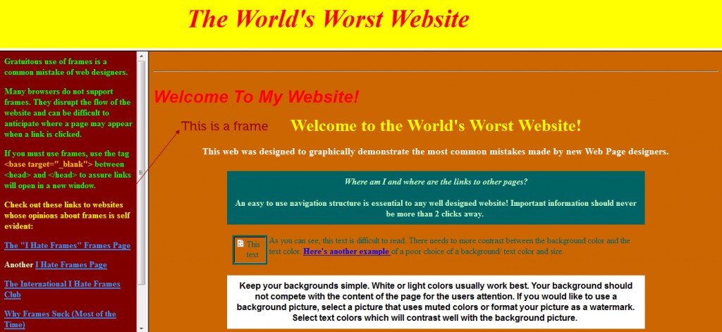
Paradoxically, there are still websites designed with the use of frames. In addition to the fact that they have become obsolete years ago, they also will not offer any help with the betterment of your site’s SEO. The use of frames will make it difficult for search engines to find all the valuable content within your site. Note that framed websites use three html files instead of one, causing all kinds of conflicts with indexation.
MISTAKE #4 – Images Instead of Important Elements
Using images as a primary form of navigation will be identified by search engines without their functional purpose. On the other hand, navigation through pure text isn’t a good practice as well. The solution? Simple. Use text-over-image techniques with CSS.
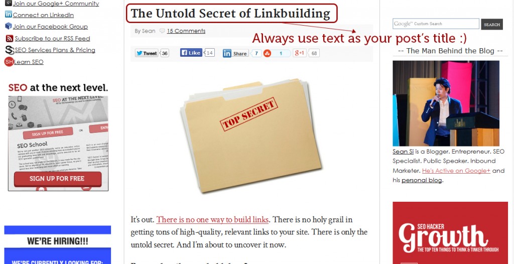
It is also not recommended to include images when using headers. Content replaced by beautiful graphics with text may look outstanding, but it will not work for SEO. Because header text is meant to highlight the important keywords, opting for images as an alternative will hurt overall content.
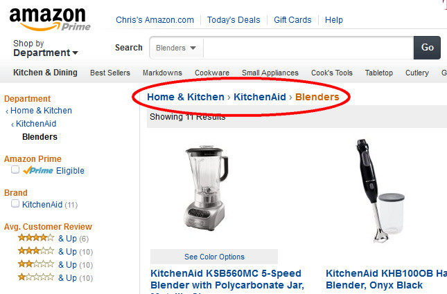
MISTAKE #5 – Lack of Breadcrumbs
Breadcrumb trail matrix that’s perfectly constructed will significantly increase your site’s search engine performance. Not only are text links easily read by search engines, but they also provide a transparent hierarchical navigation structure.
Unfortunately, designers sometimes forget about breadcrumbs despite the fact that they noticeably increase the user friendliness of a website.
MISTAKE #6 – Pop-Ups
To begin with, designers that include pop-ups are regarded in bad taste not just by their fellow designers, but also by visitors and search engines. They are annoying and usually closed by most users the moment they… pop up. Moreover, they immediately evoke prejudice about the website and search engines do not even index them as a part of the website.
With that, it can be said that it’s best to forget about pop-ups forever for everybody’s sake.
MISTAKE #7 – Neglecting the navigation standards
There are probably a few designers out there who believe that creating a totally weird site with no regular navigation elements or footer links would attract users and seem original and unique to everyone. This is unfortunate. A navigation that is properly organized is essential both for visitors and search engines.
Creative art, if not applied properly, will be treated like a poor internal linking structure, harming your rankings and reputation. The global navigation bar must be present on each page; otherwise users might get lost within the website.
MISTAKE #8 – Improper 404 Error Page
Creating a custom 404 error page is always a cute way of sneaking in a bit of humor within your website. However, this intention for creativity might lead to the neglect of more essential factors, such as the link to return to the website.
Not only will it improve the user experience, but it will also complement the overall SEO value. Otherwise, search engines will identify your website as one with broken internal links, reducing its search rankings as a result.
In general, all the mistakes mentioned above are the result of one major mistake, and that is the mistake of only regarding essential SEO factors after completing a website’s design. SEO must be treated as one of the components of design. A designer can create a perfect artwork and still be ultimately worthless if it can’t be searched. If brought to the design process early, an SEO specialist will greatly reduce costs by helping you get everything right the first time around.

