Website Accessibility Practices for SEO
Website accessibility is the ethical practice of ensuring that your website can be understood and navigated easily by disabled users. There are four reasons why you should be adding website accessibility to your SEO list:
- A significant aspect of SEO is optimizing for people, meaning we should be optimizing for everyone, including disabled users. Websites that are not optimized can lead to less searches and less visibility, since people will generally stay away from them.
- According to the World Wide Web Consortium (W3C), “Case studies show that accessible websites have better search results, reduced maintenance costs, and increased audience reach, among other benefits.” This shows that website accessibility is an integral part of SEO.
- Google values website accessibility. According to their Accessibility page, “Everyone should be able to access and enjoy the web. We’re committed to making that a reality.”
- It’s the right thing to do. Foregoing accessibility means willfully barring entire groups from accessing communication and information and hindering them from fully participating in society.
In this blog post, I will discuss five of the usual SEO practices we perform and how they contribute to website accessibility, and I will add five more practices you can adopt to make your website accessible to everyone.
Note: I made use of assistive technology to ensure the accuracy of this article.
The title tag is your webpage title. It describes your webpage to the users and the search engines. This helps with website accessibility since for visually impaired users, the title tag is read by the screen reader as the page loads, making it their introduction to your website.
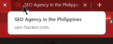
For example, the photo above shows the SEO Hacker title tag. Aside from the title tag containing a keyword we want to rank for, it also signals to visually impaired individuals that they are in a Philippine SEO agency website.
Editing the URL slug to be descriptive and accurate
A URL slug that is unoptimized or confusing will be difficult not just for search engines to understand, but also people. First, it will be very difficult to remember. Second, they could be gibberish and as a result, frustrating to listen to. Check out this Forbes article URL:

Now, imagine that you are using a screen reader. It will read the entire URL to you, so before and after you listen to the important part of the URL slug, you will also have to listen to the unhelpful portions.
On the other hand, there are descriptive URLs that are still unhelpful because they are inaccurate. As a rule, ensure your URL slug is descriptive and accurate to help your user know they are on the correct page of your website. Check out this example from the Leadership Stack blog post:
![]()
Based on the URL above, you know exactly what webpage you will be accessing. This helps with website accessibility as it gives quick and accurate information to the users, and they can move on to other areas of the page quickly.
Adding alt text to images
The alt text is what users encounter when the image does not load properly. The alt text is also read by screen readers, so this helps visually impaired people know that there is an image and what it’s about. Not putting an image alt text removes your chances of having your image rank in image search, and it becomes a barrier for visually impaired users to understand your content better.
For example, in the photo below the image has an alt text that says “Know The Signs Of Employee Burnout.”

This means that alt texts should be descriptive not just for SEO but also website accessibility, as it helps the visually impaired understand the image itself.
Adding proper headings to content
The headers of your page structure content for the search engine and the users. This practice is not just good for rankings, but it helps with website accessibility. Putting proper headers on your page ensures website accessibility for the visually impaired because the screen readers will be able to interpret the page more accurately. Hence, it will help them not just to understand the organization of your content, but to navigate it easier as well.
For example, in the photo below you will see two highlighted headers. The header saying “Before you begin” is in H2, while the “Create your findings document first” heading is in H3. A visually impaired user utilizing a screen reader and a keyboard will hear these texts read as “H2, before you begin” and “H3, create your findings document first.”
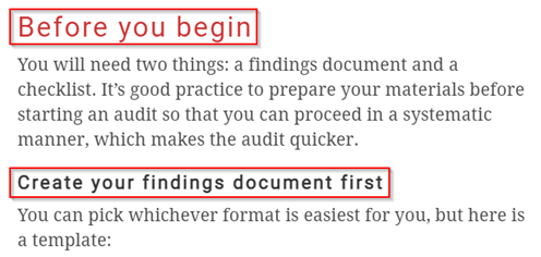
Rule of thumb: Your main header must be in H1, then the sub-headers must be in H2, H3, and so on.
Limiting intrusive interstitials
Interstitials are the annoying interruption marketing tactic where ads pop up on the page. Some intrusive interstitials can negatively affect your SEO, pulling your rankings down. But that is not the only reason why you should be limiting these pop-ups. Aside from the obvious downsides, they also restrict website accessibility.
Pop-ups that cover a page, YouTube videos automatically playing in the sidebar—these can make your page a nightmare for users with developmental disabilities and even anxiety. If you get stressed when you have all these “noisy” elements on and around a webpage, what more users who have to navigate a page through sound, have trouble with sudden sounds, or those who have to take extra steps to close the pop-ups?
One of my team members, for example, feels physically ill whenever they access a website that has multiple interstitials because they trigger sensory overload. As a result, they avoid those sites as much as possible to avoid triggering their anxiety.
Limiting interstitials can help with website accessibility because all kinds of users will have an easy time accessing and staying in your website.
Making your website screen reader-friendly
There are instances in which the content layout of our webpage suddenly shifts due to ads and other elements of our page. This is called a Cumulative Layout Shift or CLS.
These layout shifts can be frustrating for visually impaired users. Since they are reliant on screen readers, these layout shifts can cause them to miss content or be confused due to the screen reader suddenly changing what they are reading.
Screen readers such as NVDA don’t just read the contents of the page, they also read specifically what the user’s cursor is pointing at. So if the content of the area to which the cursor is pointing suddenly shifts, the user will have to take extra steps to figure out where they were originally in your page.
For website accessibility, ensure your webpage has a reserved area for dynamic content, specific dimensions for images and videos, and optimized fonts. You can learn more by checking out our CLS tutorial here.
Making the text legible
There are two aspects of text aesthetics that we need to focus on so we can make them more readable.
Font and font size
Have you ever landed on a website where you could barely read the text either because they’re too small or too stylized? It’s bad practice in general to make the text of your website hard to read as this makes potential leads leave your page in frustration. When we create our websites, we want them to be as easy to navigate and understand as possible. Overly stylized fonts and small font sizes go against that principle.
On the other hand, some visually impaired individuals who don’t make use of screen readers may still have trouble with your site even if the font size is large enough for other users. In this case, we want to ensure our website does not break when users zoom in.
A good example of this would be the SEO Hacker blogs. I will show you my recently published article on conducting an on-page SEO audit.
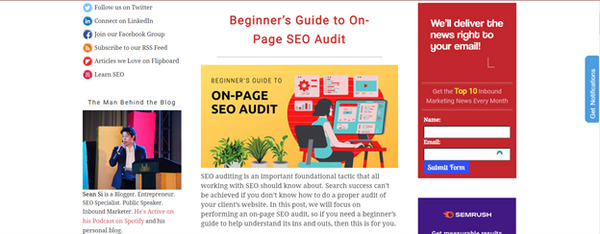
This is what a blog post usually looks like when we click on it. But if you press “CTRL” and “+” together to zoom:
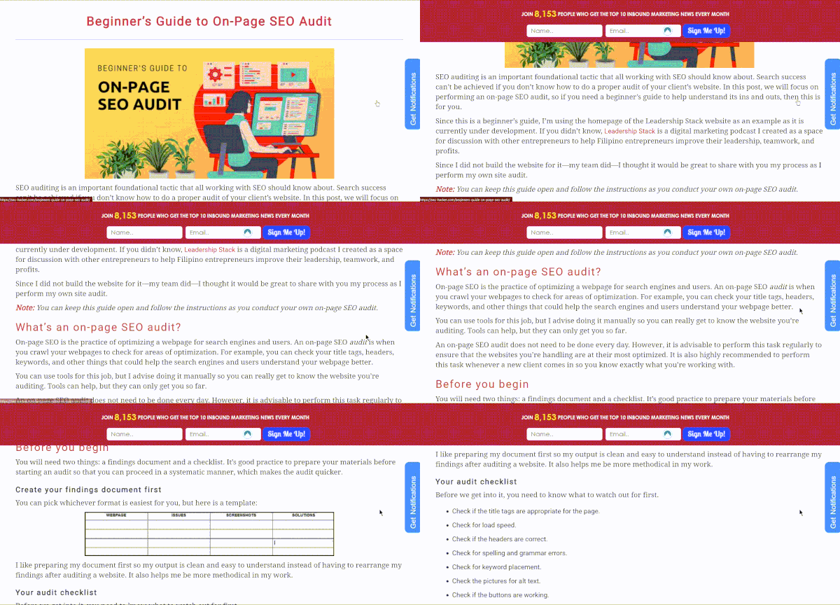
This is what the blog post looks like at 150% magnification. There is no need to navigate left and right using a scrollbar because everything you need is right there in front of you.
To make the design responsive, you can add the following to your webpages:
<meta name=”viewport” content=”width=device-width, initial-scale=1.0″>
You can see that in our blog post. Right-click then choose “Inspect” and search for “viewport.”
Color scheme
Some people try to get creative with their color scheme but end up with a website that uses low contrast between the text and the background. This makes it difficult to read both for seeing and visually impaired individuals. Designers should also focus on CTAs and links and ensure that proper color contrast is employed to make them easy to spot.
The recommended colors would still be black text on white backgrounds, but with CTAs we need to be more creative. The rule of thumb is to avoid red and green combinations to make them readable for colorblind individuals.
For example, check out this CTA from the Leadership Stack podcast.

Aside from being clear message-wise, the contrast of black text on a yellow background makes the call pop, making it easier to see and read.
Your website may be aesthetically pleasing, but is it easy to navigate for motor impaired people? A simple test you can do is to navigate your website using your keyboard only. The most commonly used keys are the tab and arrow keys. When you test your website, ask yourself the following questions:
- Does it take too long to navigate your webpage?
- Are there interactive elements you can’t access?
- Is it hard to tell where you are on the page?
If your answer is yes to any one of them, you should optimize your navigation for website accessibility.
First is to add a “skip navigation” or “skip to main content” button at the top of the page to help keyboard-only users skip the various navigation links when they don’t need them. Next is to ensure that all drop-downs are navigable using arrow keys, and that the various buttons and links are reachable by the tab button. Lastly, add “keyboard focus” to help the users see where they are on the page. It could be a highlight such as in the SEO Hacker navigation bar:

Or it could be an obvious dotted line around the link.
Adding subtitles to videos or attaching a transcript
Videos can make your content dynamic, but some accommodations need to be taken into consideration for website accessibility. Some of our site users are either hearing impaired or have sensory issues. In that case, there are two things you can do: first is to add subtitles to your videos, and second is to create a transcript.
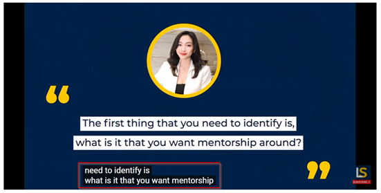
There are a variety of options that you can choose to create a transcript. My go-to for making transcripts for videos that are already published and are lacking subtitles is to use the dictation feature in Microsoft Word. When the video is mine, my other option is to create a script before making the video and attach it to the page as a transcript.
A great example of this is in online courses such as Google Analytics Academy where the transcripts are in the form of either links or PDF attachments.
Avoiding videos with flashing lights
Lastly, we need to make sure that our videos are easy on the eyes. Some users have photosensitivity and flashing lights can trigger an epileptic attack or a seizure. Trigger warnings may be a good idea, but that still means certain users won’t be able to access the content that is in your video. So to go back to the principle of website accessibility and also just to be safe, make sure to just avoid putting flashing lights on your videos altogether.
Key takeaway
Website accessibility is an ethical practice that web developers must adopt to accommodate all kinds of people. Some of our SEO practices already contribute to website accessibility for everyone, but there are other practices available that we can add to our arsenal to ensure our websites are friendly to disabled users.
Did this guide help you with website accessibility? Let me know your thoughts by commenting below.
