Web Design Faux-Pas Everybody Should Avoid
Last week I discussed the key elements every website should have to improve conversion rate. This month, we will elaborate on some of these key elements; how these affect your traffic and conversions, things that you should avoid doing, as well as tips and tricks to help you properly apply these elements on your website.
Today, our focus will be on website design.
I put web design on top because this is one of the first few things you should be working on and investing your time and money with if you really want to improve your conversion rate. This is one of the first things they will judge about you.
Take CrazyEgg for example. Two years ago, they paid Digital Telepathy around $20,000 to create a new design for them, and guess what, CrazyEgg’s conversion rate increased by 21% – they were able to earn the money they invested for the design in less than 30 days.
Now, I know your goal is to spike up your site’s conversion rates – you’re probably not reading this if you’re not interested with CRO (Conversion Rate Optimization) – and I know how much you’re excited to design or redesign your site to reach that goal, but before you do so, take these top listed web design faux-pas first, and check whether this is something you’re doing on your website.
Avoid…
1. Making your links open in a new browser when clicked
As much as you want your users to return to your site after opening a new window or page, it is something that you should avoid. Users don’t want to be controlled in terms of navigating. When a page opens in a new window and they don’t like it, chances are they’ll close that page and your website.
Allow users to take control of navigating your site by making all your links either direct links, or links that open in new tabs. That way, they are more likely to stay and navigate through your site.
2. Adding background music
We love music, I know! But we don’t all love the same type of music. Imagine visiting a website with embedded music or playlists you don’t like – you’ll probably leave that site, right?
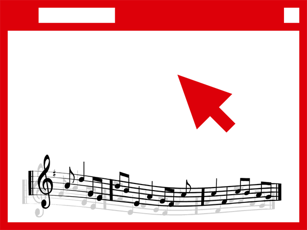
Well, it’s more than just liking that music or not. Truth is it’s distracting especially when you’re least expecting it. Plus if you have this feature, it’s just adding up to your site’s disk space, making your site slower. Unless your website is personal or private, don’t do this.
3. Infinite scrolling
Most returning visitors are looking something from your site, either they’ve seen it before and they want to check it again or they’ve scanned it but got lost, and they want to know if it’s still there. Having an infinite scrolling type of website doesn’t help these kinds of returning visitors, because what they’ve seen yesterday may not be the same thing they’ll see today, and the days to come.
Always remember that your users always want to get information in the least time, so prioritize searchability over scrollability.
4. Highly stylized fonts
When choosing a font, it depends whether you’ll use it for your header, or for other parts of your content. Always ask yourself if that font is comforting to the eyes. Is it something you could comfortably read?

An effective font is…
- One whose clarity speaks for itself
- One which can be clearly read in its uppercase, lowercase, bold and italic variants
- One that visually executes your content tone
5. Overusing of flash
Excessive usage of flash can increase the load time of your website, and not all laptops, computers, and smartphones are compatible with flash.
It is best to use compelling images and less animation to convey your messages to your readers.
6. Blending advertisements inside the content
Too much advertisements on your website’s sidebar is annoying, what more if it’s inside the content? As much as it’s helping you earn extra cents, it can also ruin your site’s readership.
Would you rather earn cents and lose readers, or get lots of readers and eventually earn by converting those readers to customers? Think about it.
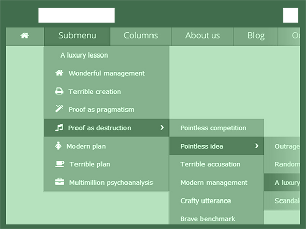
7. Multi-level Navigation
We add multi-level navigation to organize our categories, tags and other sorts of webpages, but it will only make your users hover over menus which is a bit of a hassle. What’s even more annoying though is when your audience cursor slips off a menu item, and they don’t have a choice but to let the navigation menu collapse and start over again – or worse, close your site and never go back.
Other web design mistakes you should never do:
- Requiring visitors to register to some newsletter or account.
- No search bar.
- Using of too many and harsh colors.
- Horizontal scrolling.
- Pop-up windows.
- Requiring visitors to install a software.
- “Intro”. Requiring your audience to watch or do something before they can read the actual page.
- Putting broken links.
Conclusion
If you really want to keep or even increase your readers by numbers, with the hope of having them as your customers, then work hard. You can even hire someone who can work on improving your website design.
Remember that the online world is no different from the real world, our judgments are based on things that we see. Sometimes, even if you have good content, but it is not pleasing to the eyes, there’s still a big possibility that they will not stick around your site.
More to come!
This is just the beginning of our journey to conversion rate optimization. We will discuss more of these elements in the weeks to come. So, stay tuned, start reviewing your website, and be prepared for more traffic and sales!