How to Make your Blog Design Optimized for Search Engines
There are so many different blogsites out there talking about so many different topics and wanting to rank in the big three search engines. Search engine traffic is one of the best ones in any website / blogsite. Design is one of the places to start with your SEO’s On Site optimization. Right now, you might not know it, but your design has a big impact on your website’s SEO effectivity.
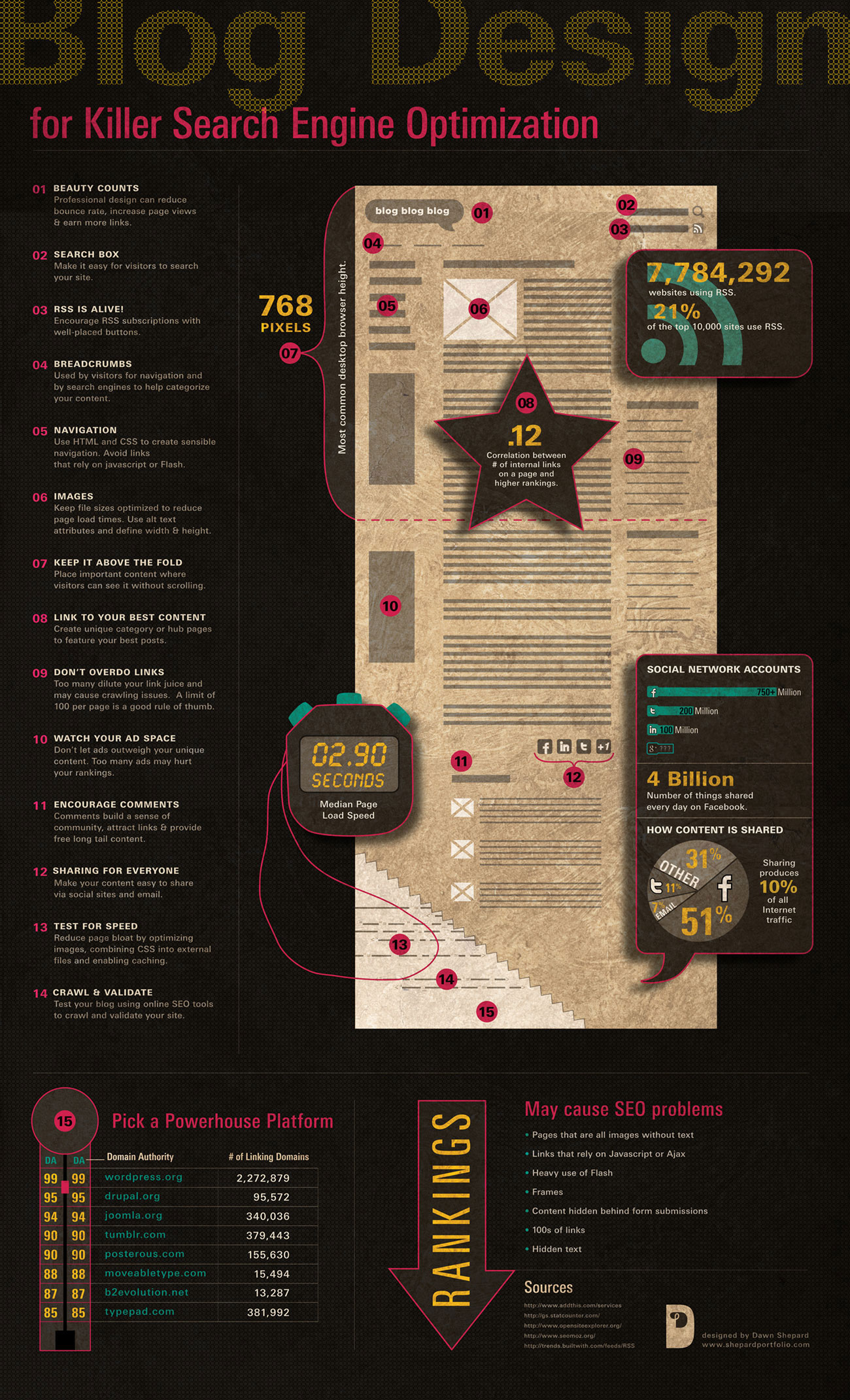
So here’s the list provided by Cyrus Shepard from SEOmoz and his wife Dawn Shepard (she designed this beautiful infographic) as they describe how your blog design should be like when you want it optimized for search engine friendliness.
Note: This post is reblogged by my brother Kevin Si who is the chief designer of SEO Hacker. You can follow his rants and tweets here.
1. First Impression is Important
No matter how good your content in the site is, its design will always be the first thing the user sees. When your website looks crumpled and cheap, no matter how hard work and furnished your article is, your credibility loses by a huge amount which might increase your visitor bounce rate instead of getting quality hits to your website.
Today, there are lots of web design services around the block that can give you a good design at a very low price or, if you are using pre-made systems like WordPress, there are lots of beautiful themes that you can use on the internet that can boost up your website’s beauty and credibility – which can attract more readers.
2. Seek and you will find
Don’t rely much on Google to find your articles for you. Your website itself should be self-sustaining in making your readers look through more into your pages. A search feature on your website not only helps your users find things that are more relevant to their interest but also helps you in gaining more traffic for your site. Remember User experience is very important in having a good relationship with your readers.
Another good feature of a search in the website is that you can find which keywords are effective and are being searched for in your website. This might give you ideas on what articles you can write and/or tidbits you can improve on. I believe this is called keyword discovery and user behavior as stated by SEOmoz
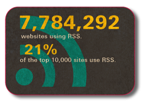
RSS is something that has been always overlooked by most blog type website. Not only does this feature help you earn avid readers, but it also helps the readers themselves get updated as they have found your website to be informative. Tick this feature on, the little effort you give can go a long way.
4. Crumbs, crumbs
It may sound as a little insignificant but breadcrumbs hold a good part in making your website have a better experience rank to both your readers and Google’s search algorithm. Not only does it help your readers know where they are in your vast internet space, it also helps any search engine to sort your pages in the right category.
5. Navigate Properly
One good principle in creating navigation is try to give your readers the fewest clicks to their desired destination as possible. User experience is always important when your goal is not only get more readers but also have them find your blog posts not only of their interest but also of their comfort.
Also for those seeking to optimize their website in terms of search visibility, it is highly preferred for you to arrange your priorities and make your navigation to have a flat architecture than those with long sub categories. Another point of fact is that, try to minimize the use of JavaScript and/or flash links as search engines do not find it best to crawl those sets of codes.
6. Quality begets quality
No matter how substantial your article is, a good image will always boost your article’s visual design creating a more appealing look for readers. A good looking image will refract a good article, a bad image on the other hand will deceive your readers that your writing is as well.
A bad image also connotes the idea of:
● Good but is irrelevant image to your article.
-This gives your readers the impression that you’re either using auto generated images from the web or you just don’t give much effort to your blog therefore you have visible errors in your front-end.
● Bad quality images
– Obviously a bad quality image is a no-no to your blog because aside from the fact the image is being a very unpleasant visual item for the readers, it also hints to your readers that you have not much taste for quality awareness.
7. Keep it in the Field
The standard size of an average monitor display is 768 pixel in height (width is not of the matter as it depends on your design), with this in mind, in that first 768 pixels that your visitors see, make sure that the substance that is visible in that area is the best that you can offer your readers as this can determine if they will read the article or not. Quote a question, an anecdote, or anything that can capture their interest and/or fancy.
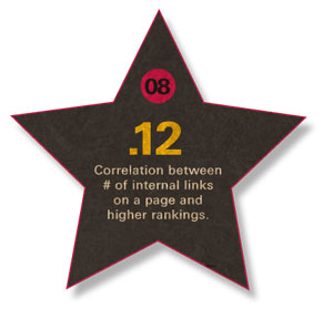
If you look at the top ranking sites, usually they provide inter-links in between one article to another, in keywords that you might find interesting. In some cases, they link on other works either to help you understand the topic more, or provide you with more interesting materials other than your current read. Other than the idea that this will educate or entertain your readers more, this also helps in making your readers stay in your website longer in which they can explore your website far more easily according to their flow of interest.
9. Link Lightly
Do not over do your page with links. Yes, links do good and wonders for your blog but having too much of something has always been bad. If you dilute your webpage with too much links without proper page rank, you may have problems with the search engine causing your ranks to be a bit more confused than what you hoped for.
If you have links that holds more importance, it is best that you place it in the body section as the header and the footer get lower priority in terms of search engine value.
A good rule of thumb is to place a maximum of 100 links per page.
10. Don’t keep Ad -ing
There was a recent study that has found there seemed to be a negative correlation between ads (in particular Google’s) and the search rankings. It has not been 100% proven as to how, but there might be damage when you prioritize your ads rather than the first thing you are presenting to your readers which is your content. Yes ads are a great way to earn passively with your blog, but as soon as you focus on it much more with your presentation, there will be a problem that is visible not only to the search engine but to your reader as well.
11. Social Interaction goes a long way
If you have an account in one of these websites: Facebook, Twitter, MySpace, Friendster (used to), Google+, Multiply and/or YouTube – you definitely have an idea of how social interaction interests a lot of people.
Communication is not a one way transfer of information, it requires feedback. In which there is a need for a reciprocating action from the receptive end to reply back with another idea. In the world of the internet, it’s called “Commenting”. Commenting is the blog’s form of communication with its readers. A blog that can communicate with its readers is a blog that grows; Grows not only to the reader’s favor but to the search engine’s as well.
Have you ever seen the word “retweet” “like” or “+1″ in blog posts? Have you ever used them? Sharing in online media now produces 10% of internet traffic. Facebook by itself shares 4 billion pieces of digital content everyday, digital content includes: videos, photos, notes, posts, links etc. Imagine how many people can see it if you put a share feature beside your article that enables your readers to have 1 click access to post it on their Facebook or twitter – your market expands exponentially!
Also now that Google+ is starting to play in the social game, their +1 feature also plays a good leverage in boosting up your ranks in search engine according to how much “+1″ you get from your circles.
13. Need for speed
No matter how beautiful your blog is, with all the fancy 3d illusions and the large hi-res background, if it is not optimized for fast loading, you will probably lose readers. Why? What good is your web design if it is not visible to all? Always remember that the internet is beyond your borders, its international! Your readers come from everywhere; and everywhere means that they don’t always have the same fast connection that you have. To some it may take as fast as a blink of an eye for the page to load completely, To some, it may take as long as 7 seconds, and still to some, it may take longer. According to SEOmoz’s Geoff Kenyon, an average load speed should be about 2.9 — this is to consider that you want to be part of the 50% of the websites in the internet, but heck, if you can optimize it to be faster, go ahead!
14. Connect, Correct and Direct
When you think you’ve finished your site already as you type the last code, think twice. No matter how proficient you and your developers are, there will always be a problem that will arise sooner or later. Since we are talking SEO, the hardest thing about these types of problem is that it’s invisible. Problems such as broken links, improper redirects, missing pages, etc. are not visible much at the front end. So you need tools that are specifically designed for these problems such as:
● SEOmoz Web App
As for design concerns, you also have to test your work on different type of browsers and different sizes. The most famous site for this service is Browser Shots which offers it free to some extent.
Since we are discussing about blogs, if you have yet to decide on how to make your website, there are already ready-made systems provided from the internet. The most reliable, common and recommended are
● Tumblr
These systems provide you with versatile but comfortable options to help make your process in creating one easier. It’s secure, user-friendly and customizable so if knowledgeable, you can tinker around with it according to your wants or needs.


