Pro Tips for Growing your Mobile Ranking Significantly
The best part about SEO is also its worst part. SEO specialists are almost always going in blind especially when Google releases an algorithm update or two.
However, let’s focus on the more optimistic part and talk about how we can go about this, specifically with growing your mobile rankings.
The best way to keep yourself up to date with Google’s algorithm updates is by taking a look at Google’s Webmaster Blog. With that said, it is worth noting that majority of Google’s updates over the past couple of months focus on mobile instead of desktop. Their most notable update was when they announced mobile-first indexing, which we also covered.
Anyway, the gist of Google’s current campaign is focusing on Mobile-First so I’m taking this opportunity to list down a few things you might want to keep in mind order to make sure that your website is mobile-friendly. Let’s get started.
1. Get to know your site: Find out if it’s mobile friendly
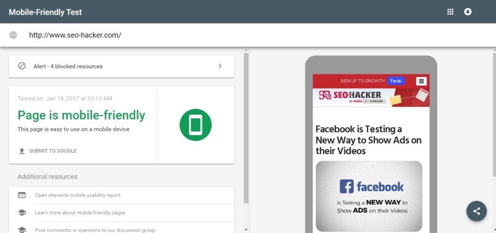
First thing’s first right? The first logical step in this endeavor is finding out if your website is Mobile Friendly or not. The easiest way to do this is by using a tool – and it’s worth noting that this tool is accurate because it comes from Google Search Console.
First step is visiting Google’s Mobile-Friendly Test. The website or tool is fairly simple to use; in fact all you need to do is type in your website’s URL and that’s it.
So now that’s done, you now have an idea if your website is mobile-friendly or not. The next step is doing a full audit of your website to see where it’s strong, where it’s vulnerable and find out what you can improve. The reason for this is that there are many factors can potentially affect your SEO rankings.
You’re going to want to make sure that your website is crawlable where it counts and protected where it should be. After that is finding a tool that you think is suited for your website’s needs. The things that you should keep in mind when looking for an auditing tool is that it has to be able to perform a full-audit on your site as well as being able to search for every possible SEO factor that might be affecting your site.
When you’re done with the mobile-friendly test as well as finished with your website’s full audit then solving whatever problem that you’ve found should be your priority. There are minor SEO mistakes that you could be missing but here are some of the more common ones that you should definitely fix:
- Slow-load times especially on Mobile
- Broken Links
- Blocked Resources such as images, Javascript and the like
- Unsupported Content
- Intrusive ads
- Mobile-404 errors
As you go through the list of your website’s problems, it is prudent to track your progress by using Google Search Console. Simply go to Search Traffic -> Mobile Usability so you can monitor your website as well as any error that the tool can find.
2. Optimize your website for voice search
Google has been working on perfecting Voice Search for a while now. This is evident in other companies’ endeavors in order to make voice search viable, such as Apple’s Siri or Microsoft’s Cortana. In line with this, Google has recently announced that Voice Search is the fast growing option for search – and it may soon overtake typewritten search but I personally believe that scenario may not happen for some time.
Some background on voice search: According to Google, at least 55% of teens and 40% of adults were regularly using voice search – the twist is that this was back in 2014! Obviously, that number has grown significantly since then.
Anyway, optimizing your website for voice search isn’t really difficult. The key is to understand why and how people verbally ask search engines. Here are some examples:
The How: The main difference between voice search and typewritten search is that typewritten queries are often short-form and are sometimes just the keywords themselves. Some examples include “Best SEO Philippines” and “Best Burger in (location)”. Verbal queries, on the other hand tend to express complete thought such as “What is the nearest movie theater in (location)?”
The best way to ensure that your content is included in voice search is to, in turn, ensure that your SEO includes long-tail keywords that directly address these queries.
The Why: Sure, addressing long-tail keywords is easier said than done but truth be told, it’s really easy as long as you know the why. Here’s a guide that you might want to remember when you start crafting long-term keywords to make your website voice search optimized:
- I want to know _______
- I want to go ______
- I want to do _______
- I want to buy _______
The guide is mentioned at Google’s Micro Moments Guide and according to the same article, voice search is usually done to satisfy the four above queries. Google refers to these types of questions as “micro-moments” and they are often asked to satisfy an urgent need. What this means is that these questions should be answered in a way that’s prompt as well as accurate.
3. Local Search is something that you should prioritize
Voice search is trailblazing into a promising era of fast, accurate searches which means that local searches are also steadily increasing. According to Google’s Micro Moment Guide which is linked above, Google believes that the search for local business that are near the user have increased to at least twice their norm. Google also says that 1 in 3 smartphone users will most probably purchase from a store or brand regardless of what they initially wanted precisely because Google listed that brand first when they made a quick search.
Crazy. right?
What this means is that local search is definitely something that you should work on as soon as possible. Not only can it make your business more marketable, it also allows your website to become more SEO friendly. Google likes that so they list websites like that first and it wouldn’t hurt to be liked by Google, yeah?
Furthermore, if you sincerely want to be mobile-first (After reading through this article, of course you’d want to be mobile-first), you’re going to want to be the top result for your field of business or for the services that you specifically offer. Here’s what you can do:
- Definitely register at Google My Business. Here’s the link.
- Represent your business properly by including high-quality photos of your business or your services/products.
- MAKE SURE THAT YOUR ‘CONTACT US’ PAGE IS CONSTANTLY UPDATED. Also, it won’t hurt to make your contact page really visible so Google can display it on their SERP when it counts.
- Schema Markup helps. Include it when possible!
- Finally, one of the most freely accessible assets that you can request from your users are REVIEWS! It’s a win-win scenario, really. Make sure that your customers/users are satisfied so that they’ll give you good reviews which in turn makes your business looks good. Win-win, right?
4. Accelerated Media Pages!
Google is hard at work in promoting their latest endeavor in the form of AMP or Accelerated Media Pages. These pages are well-liked by Google simply because they load instantly – or at the very least, as fast as possible. Google says that AMP loads 4x faster than regular mobile pages and are well-suited for mobile users because it offers them everything that they need: Instantaneous results which promptly solves their more pressing concerns using as little data as possible.
AMP pages are actually more simple than you think. They basically use stripped-down HTML coding as well as a bunch of specific, custom tags that are designed to let these pages load faster than regular pages. What this means for your content is that you should have two versions:
- Regularly written content with multimedia design in order to make it pleasing to look at.
- A stripped down version of the article designed for AMP which means no Javascript, extra content, lead forms and the like.
WordPress is actually really easy to work with when it comes to AMP. Install an AMP plugin as soon as you can just so you can enable AMP for your pages. As of writing, AMP is still being strongly pushed by Google – and I can’t blame them. AMP is nothing but good for your website if it help your content load extra fast, as well as help people find your content in the first place.
Key Takeaway
2017 is the start of Mobile officially taking over the internet if we take 2016’s monthly heralding of the age of mobile into due consideration. What this means is that Mobile is no longer simply a trend, and instead it is something similar to a force of nature – we have to accept that it is inevitable. 2017 marks the year where mobile-friendly is slowly repealed in favor of making websites mobile-first and there’s a very big divide between the two.
Do you have any questions? Any experiences with mobile browsing that you want to share with us? Let’s talk about them in the comments section below!

