The SEO Hacker Mobile Optimization Checklist

SEO in 2018 is another year where big changes are happening, as Google aims to roll out numerous updates that would aim to improve the user experience, especially for mobile websites. When it comes to the mobile experience, this has been seen by Google as the future platform in which search would thrive more.
This shift into a mobile-first approach is highly evident, as Google has rolled out updates like Google Speed to optimize mobile rankings, the increased focus on voice search and video content, and the integration of AMP in multiple websites. With these set of changes, it is best to ensure that your website is highly optimized for Mobile SEO. With these changes in mind, here is our mobile optimization checklist that would create a mobile-friendly website.
Integrate AMP
One of the first major steps that you must take in order to create a mobile-friendly website is to integrate AMP. The Accelerated Mobile Pages project has been launched by Google a few years ago and is one of the most important elements that must be integrated into your website. Google has been gently integrating AMP into their services, such as emails and advertisements, featured snippets, and much more.
Applying AMP on your website may seem like a complicated process for some. Thankfully, plugins like the one available on WordPress help make the process much smoother and helps you create a website that is mobile-friendly and responsive. With AMP becoming an integral element in all websites in the future, it is better to come prepared.
Simplify Navigation
One of the most important elements of good web design is having well-designed navigation menus and buttons. One of the main reasons why users leave websites and refuse to go to other is because they have problems navigating and exploring the website. This can mean poorly designed menus, confusing layouts, and incorrect links that direct users to different pages.

When it comes to designing the website’s navigation, simplicity is the key, as you would only need to make sure that you would be able to help your users look for the pages they want to access within your website. The best thing that you can do is to make sure that the navigation menu for the desktop and mobile version of your website similar, as this would make navigation more hassle-free and easier for your users.
You can also make use of drop-down menus for mobile, as this helps in making touch navigation much easier, as using certain desktop formats can make it more difficult.
Responsive Design
Along with AMP integration, Responsive Design is another important element that must be integrated into your website, as it helps it adjust its size depending on the screen that it will be viewed on. This has been proven effective when it comes to making mobile viewing much more convenient for the user.

One of the best ways to test if you’re website has applied responsive design, you can use Google Lighthouse and Woorank, which analyses your website’s mobile-friendliness, which includes AMP and Responsive Design. Using Responsive Design also helps eliminate pinch-zooming, which is a common feature on websites that can make navigation much more challenging. This is one of the best ways to improve the user experience, which in turn helps bring in more mobile traffic that increases your rankings.
Fast Loading Speed
Page loading speed is one of the most important ranking factors in SEO, as it can be the difference between a user staying or leaving your website. For the best results, the optimal loading speed of a website is around 3-5 seconds, which is already zippy for most users. There are various tools and plugins that help improve and assess your website loading speed. These tools include Google’s Test My Site, which is a simple tool that gives you quick data on how fast your website loads.
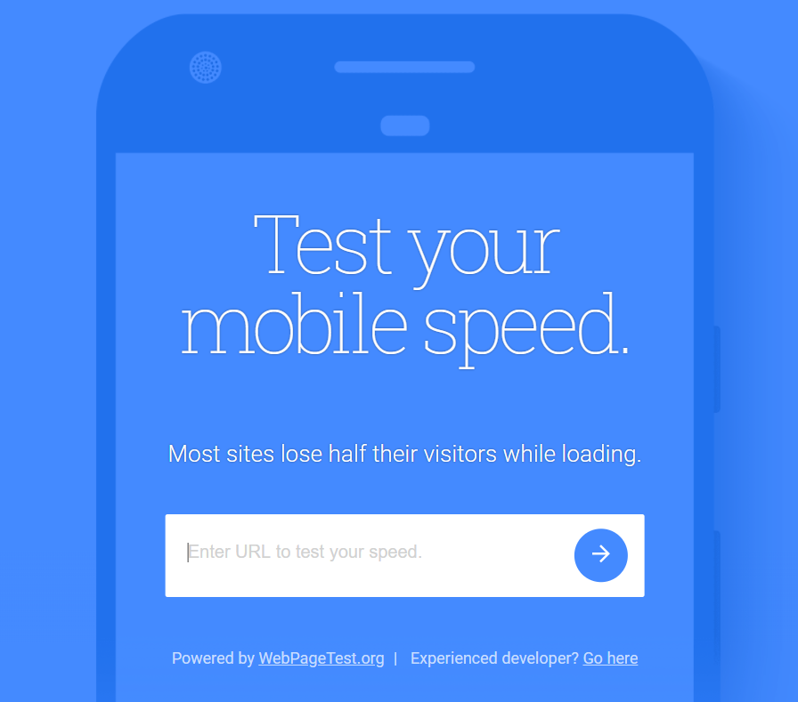
You can also use Google Lighthouse to asses mobile loading speed, and plugins like W3 Cache help make loading your page much faster through cached data.
Do not restrict content
One of the biggest mistakes that some websites do when it comes to viewing content on mobile browsers is that they will restrict users into viewing content such as blogs and request them to access the full version on desktop. This is a restrictive practice that will only bring about negative reception and dissatisfied users. While similar practices such as adding paywalls are somewhat similar, that is an acceptable practice, as it is a sales generating model.
Restrictive mobile content should be something that should be left in the past and has no place in today’s internet. Make sure all of your content is accessible by everyone with no exceptions.
Key Takeaway
Going mobile-first is an agenda by Google that is crucial for their vision of how search and internet navigation will be done in the future. This makes mobile optimization a way to future-proof your website and would bode well for SEO as well. With this checklist, you are ensured that you have a website prepared for the future.